The Publishing House which is always good for a surprise!
or in real life:
We know it is hard to make a choice, as (almost) all books of Darling Publications are extremely interesting and desirable, different in concept, size and quality compared with other publishers, but as in real life sometimes one has to make decisions.
So please choose in the menu the subject you are interested in. (You still can click on the others later)
Welcome to the World of DARLING PUBLICATIONS!
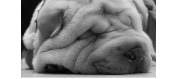
Those art books with the dog face on page one …,
that cute chinese dog with the wrinkles.
Something about the history of Darling Publications:
How everything started …
Darling Publications from Cologne was founded in 2003 as a one man try-out project for just one art book – a first small step in the big unknown publisher-wonderland. The first publication was designed on the computer of an artist, and blessed with all charming and less charming beginner´s–mistakes one can imagine (or even not imagine!). The images turned out to be too darkly printed, partially caused by a monitor which was small, old and bad (therefore not color-calibrated, which fortunately was not an issue, as it should be printed in black and white) – and partially by bad photoshopping skills from the artist, who ensured „photoshop is really easy“. A certain concept was made by the publisher himself: the total amount of images (354) in the book should exceed the total amount of the copies of books printed and none of the spread pages of ca. 200 pages should be the same design. A zoomed-in detail of an image, showing Darling asleep, was chosen as the book-cover – a guideline found in all following books, as every single book will show this image. It is the first thing what everybody will see first, when opening the book. For the logo, Darling I was put on 3 enormous vintage books about british antique furniture, a motive which from the 2nd book on was going to be seen as embossing on the hardcover back of every book. On the recommendation of a befriended artist, printing was done in some provincial small backyard printer shop. At the question if one could see how it was going to be printed as it was a premiere, for some still unknown reasons it was mumbled that it was somehow not possible. It was the beginning of a series of books with the same artist where everything, even the format and title was chosen decided by the publisher, today everybody still thinks that was the concept of the artist.
This first printed product was thrilling, exciting and overwhelming like the firstborn baby. Although badly printed, nobody cared. Hey, we made a book! A real book! The atmosphere from the printshop was friendly and the owner was a really nice guy. The badly glued final books were not even all cut rectangularly– resulting is a sometime trapezoid book. But therefore the costs were very moderate. A plan to reprint this book some years later failed, as it came out that the costs of just the paper used in the 1st edition (an ecological, greyish high volume recycled paper) on a regular (and legal??) way would be higher than the entire production costs (printing + bookbinding!) of the 1st edition! That was in January, 2003 – today this very first book is a heavily sought after collectors item, in fact it seems more desirable than the original works which are still not in big demand.
Today …
Today, after some years, after about 100+ concepted, designed and produced books, it is basically still the same one-man project.
The computer is not borrowed anymore, a product with a fruit logo has found his place underneath the table accompanied by two large monitors on top of the table in the premises. Printing is entirely done by the very best printer from Cologne: Asmuth Druck + crossmedia.
The books are now all thread-stitched and beautifully bound in hardcovers with exquisite linen, silk or rare fine cloths. As a premiere, every „deLuxe“ edition of „The Bows of Nikolai Kittel“ was each bound in an entire goat hide, specially coloured at Darling Publications specifications, by the supplier of leather for Hèrmes of Paris! The Japanese edition in an edition of 33 copies in Pink leather, custum dyed in the Elvis Presly 1957 Caddilac Pink with Baby Blue Embossings.The DeLuxe Leather, cow hides for the XXL Full size (160 x 60 cm) cello book, is be supplied by Bridge of Weir from Scotland, the supplier for Aston Martin. Embossings, mostly in copper, on all books– responsible for the stunning feel and looks of the books is the bookbinding company of Hendricks + Lützenkirchen, a highly motivated and traditional company in Kleve. Rare to find, such companies!
Books like the 14 kg, 2400 page Compendium Finale of Contemporary Jewellers, the 90 x 35 cm Bow Books and the 160 x 60 cm Cello Book were publications which were the main reasons that Darling Publications was compared with its far more well known and respected publisher colleague Benedikt Taschen, but actually the reality is that the Darling creations, modestly speaking, surpassed already the admittingly nice books of the colleague Taschen quite a bit in dimensions and print quality. Not to forget that the exclusivity of the Darling Books are unbeatable concerning its limited production. Handmade books in editions from 9, 25, 33 till 100 copies can be considered as real rare and limited editions. Copies of more than 1000 can´t seriously be considered as limited editions except by very talented marketing individuals and non-discerning book collectors. So the description for Darling Publications to be „the publisher which starts when Taschen stopps“ could have a certain quantity of thruth and the creations prove to be undeniable facts.
Several artists have found through their debut publications from Darling Publications (mostly their very first) their first galleries, Others, already well-established artists desired more authentic, fresher and inspiring publications (just like those from Darling Publications?) preferring these over the more standard, but boring books (in the German language they even have a number-code for this description: 08-15).
Some Darling Publications artists have reached unforeseen high levels of recognition through the publications and their synergies (although sometimes not realizing it), so that those became imperiled for the known Icarus effect. After 100+ art books this fact became a sort of statistic in our experiences. This a sad but probably part of human behaviour, when the own talent cannot keep up with the own ambition.
Not forgetting the roots…
Unaffected by the fact that the manufacturing quality went straight into stratospheric zones after Mr. Asmuth took over the printing part, the less charming design-beginner-mistakes are gone and printing quality has improved dramatically. However, the charming beginner-mistakes are often still found in the books of Darling Publications. This refreshing personal touch, representing and reminding at the once naive but utmost enthusiastic desire just to create a beautiful book, not only shows the initial courage to just start and make the very first book without any professional experience or knowledge, but also functions as an excellent final test: is the publication convincing in all its intentions – is the entire dramaturgy strong enough to survive any possibly not 100% professionally executed design and typography? If the answer is yes, a certain amount of „laisser faire“ or „surprises“ is accepted as destiny or fate; and lived with happily ever after. Beside the more philosophical acceptance, this one-man publishing house does have to humbly admit that even after now almost 7 years of making books (seven years is actually enough to learn to do design and typography a lot more perfectly), the fact is just that Darling Publications ranks the own personal conviction of the books by the publisher as the very highest and therefore first priority.
The name
Before publishing the very first book the name of the still to be founded publishing house was discussed during a party with many artists, amoung them several well known professors of the Düsseldorf and Berlin Art Academies. Two options was suggested: „Andy Lim Verlag“ and „Darling Publications“. The name „Andy Lim Publications“ was immediately favoured with the main reason that it sounded much more serious.
So, of course which name was chosen …?
Darlings …
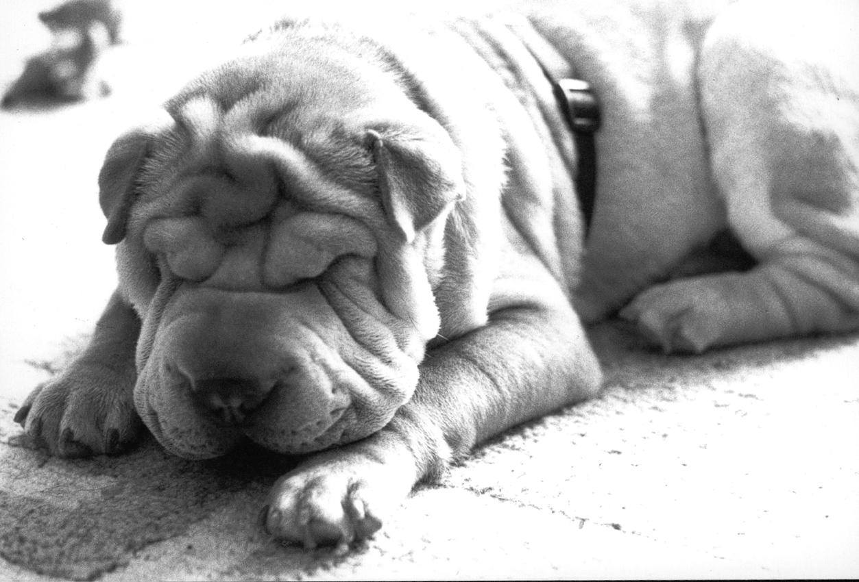
Darling I, (This Shar-Pei dog, sweet, unequaled in personality and sometimes weird) was the iconic representative, logo, founding member and eponym of Darling Publications. He has passed away and remains for those who knew him, unforgotten in their hearts. For those who never met him, he will be remembered as „that cute and beautiful first page baby wrinkle dog“ in thousands of beautiful art books. Today his successor, the gentle and sympathetic Darling II, of noble Belgian-Italian bloodline, is proud to have the honour to represent and announce the title on every first page of any Darling Publications book. He does this in a full portrait, the eyes alert, the expression charismatic – the spirit of this small but vibrant publishing house couldn´t be represented better.
Some modest world premieres…
First book with more images than the entire print run edition.
First book where the spine of the book is thicker than the width and height of the book.
First book showing Bows of the violin family full size (a 90cm long book)
First book with a XXL Photo – edition of 300 x 180 cm.
First book where every single copy of the entire edition of 1000 copies has different cloth / end paper combinations.
First black and white printed book with additional duplex, triplex and K-tripleG quadruplex.
First book showing a full size Violoncello, the book was 1.60 m tall!
Etc. etc.
Collectors …
Horrendous prices for early already out of print books have been asked (and paid!) in the fine art books secondary market– unfortunately not into the pocket of the publisher, as these early books were mostly given away for free. Many of the books are not accessible anymore by various reasons; Editions of 9 (!), 100, 250 or 500 books are not a lot for a world population of approximately 6,8 Billion people. But even as the vast majority would be not really interested in art books, there are definitely mostly more than 500 people interested in exquisite made books. There are already book collectors which are eagerly collecting Darling Publications books- to whom the contents are of secondary importance! Here we do see that the intended goal to enthuse people with just the physical appearance of an unopened book succeeded, Although flattering, it is the content which counts. (in the case of The Compendium of Contemporary Jewellers, the content counts literally 13,5 kilograms and the case is admittedly spectacular and beautiful too!) Those who ever had the personal pleasure to hold any book of Darling Publications in their hand (OK, the Compendium needs two hands), are probably able to understand the overall raving reactions.
Finally the www…
7 year long Darling Publications managed to stay quite anonymous under the radar, partially because of the personal modesty of the publisher, partially because we are somehow old fashioned, sort of more old-school types. After many years of requests for a documentation on the internet of the books from the beginning years till recent productions. For those who did not have the opportunity for a personal encounter and as the early works are becoming scarce, it remains the only possibily to meet the growing demand to get to know the publications.
Now, 2011, Darling Publications is finally showing a simple presentation of the books online. Although Darling Publications has a certain sympathy for chinese sayings like „a picture tells more than a thousand words“, we believe in the need of adding the following words: „but to hold a book of Darling Publications in the hand tells more than a thousand pictures!“ (except in the case of The Compendium of Contemporary Jewellers, which has more than 10.000 pictures and need two hands to hold)
Today, 2014 and 3 years after Darling Publications went online, we decided to go on and present more of this publishing house, mainly in pictures…
We still kept our popular (mostly) start page, where our “click here with the mouse” is taken quite literally as one notices…
We did it Darling´s way…The Darling Style.
The ever increasing demand for books, which are concepted and designed by the publisher himself, despite the facts that there are enough talented and professionally more than perfect graphic designers around and available, does show that the way of Darling Publications is obviously a right way. The way known to the insiders as The Darling Style. The publisher thanks all the fans for their encouraging and loyal reactions of the past years as much as all the critical and sceptical non-fans or frustated artists (successful and unsuccessful ones!) who even boosted the energy level needed to keep the chosen Darling way of creative resistance.
Future publications …
Darling Publications announces herewith for the near future amazing projects which are so spectacular, but unfortunately also sort of secret, that we cannot tell in details what it is about. Sorry!
But we can ensure our fans that the results will be worth the waiting time!
So, have patience and keep waitin‘ & whistlin‘
Lieber Andy,
Wie geht es Dir? Schön zu lesen, was Du jetzt machst. Ich würde mich sehr freuen, wenn Du Dich male melden würdest.
Liebe Grüsse
Etienne